Responsive Website Navigation

In the recent years, there has been intense competition in the world of internet and there is an utmost necessity to create a good website that has excellent layout, attractive images, easy navigational tools, relevant information and meaningful icons to attract visitors and to get more traffic. In order to evaluate the performance and drive sales, there should be good navigation facilities in your website. Responsive Website Navigation is the concept used in most of the websites today since it can adapt its form to any kind of devices such as PC, tablet, mobile, video game, etc.
This makes the user view the information of website in the best format in their mobile device with losing the contents. The responsive layout is the trickiest of all as the data has to fit in a small screen.
Benefits of Responsive Website Navigation
- User experience –The users are able to view the content of a website using their small mobile devices with the same experience they get in larger desktop screens.
- The contents are easy to understand and also have flexible fluid proportion-based grids to view all the options.
- The scrolling and planning system along with easy navigation is one of the important benefits of the responsive menus.
- The responsive web designing is an effective approach to make your website more creative and interesting.
More from Menus
-
 September 12, 2012
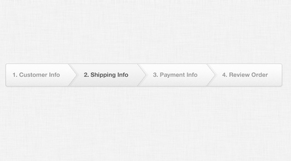
Checkout Process Navigation
-
 August 25, 2013
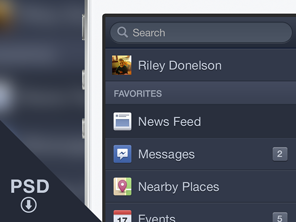
Facebook iOS Menu
-
 September 24, 2012
Dropdown
-
 September 12, 2012
Dark Navigation Menu
-
 September 12, 2012
Stitched Menu Navigation
-
 September 12, 2012
Menu Notification Badges