Checkout Process Navigation
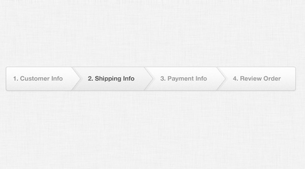
A web design clicks with users if it makes their navigation experience easy and comfortable. Although this is the basic criterion for any web based project, you have to pay special attention to it when you build an e-commerce site. If you want a ready-made solution for your site, take a look at Checkout Process Navigation (PSD). Your users will be at ease if they know about the steps they’ve performed so far and how many are still left to be performed by them to checkout.
To ensure this in your design, you can use checkout process indicator that clearly indicates where exactly they are in the process to receive delivery of the products at their doorstep from shopping carts. The indicator images usually appear on top of the checkout page, indicating the current activity of users in the process. The images can include different steps, such as shopping cart, order confirmation, checkout page, etc. based on the requirements of a project.
Why Use Checkout Process Navigation (PSD)?
This readily available checkout process indicator is recommended for use for its amazing features. Some of these are shared below:
- This checkout system indicates total number of steps to be performed and the current position of the user in an effective manner.
- The color scheme and design of this template is simple yet attractive.
- Its PSD format allows you to modify it according to your needs and requirements.
More from Menus
-
 September 12, 2012
Darky Navigation
-
 September 12, 2012
Settings Dropdown Menu
-
 September 12, 2012
Sticky Admin Bar
-
 September 20, 2013
Navigation Menu with Notification Badges
-
 September 12, 2012
Dark Navigation Menu
-
 September 29, 2013
Flat Toolbar