Dark Itunes
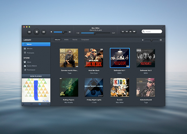
Dark iTunes has won the hearts of millions of designers all over the world. Yes, this exclusively designed Dark iTunes is the latest rage and why not when it has all the elements perfectly designed to give a revolutionary new look. We all are aware of the designs that already exist in the market but they somehow tend to go back to the old design and are just copycats of the existing ones.
The background color and the buttons tend to complement each other pretty well and that too without giving a sense of being overdone. The thumbnails in the album window are arranged perfectly rendering a classy look that many designers believe a player design should have.
Here is a list of the features that you get with the PSD design:
- Well organized panels
- Revolutionary player UI
- Easy access to Albums and Artists
- Advanced search design
- Color that suits all themes
- Prominent buttons
- Glamorous Fonts
The UI designs for Mac PCs are experiencing random changes and new designers are trying out revolutionary elements to make their designs acceptable and popular. Dark iTunes is a step ahead towards addition of elements that makes the designs look fresh yet retain the old world charm.
More from Misc
-
 September 12, 2012
Popup Modal Window
-
 October 29, 2013
Nexus 5 Template
-
 September 11, 2012
Pretty Little Pie Chart
-
 September 12, 2012
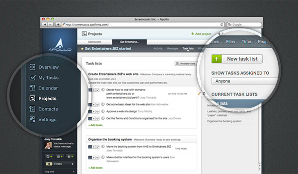
Loupe: Screenshot Magnifying Thingy
-
 September 13, 2012
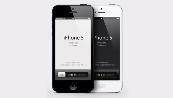
iPhone 5 Psd Vector Mockup
-
 September 10, 2014
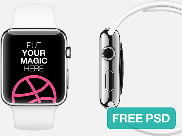
Apple Watch Free PSD Template